The Art Of Colour: Designing With Intention & Character
Colour in interior design is a fundamental element that can make a huge impact on a space, but is often viewed as intimidating or overwhelming. Here are a few tips on how to incorporate colour in your space to create a balanced and harmonious design.
1

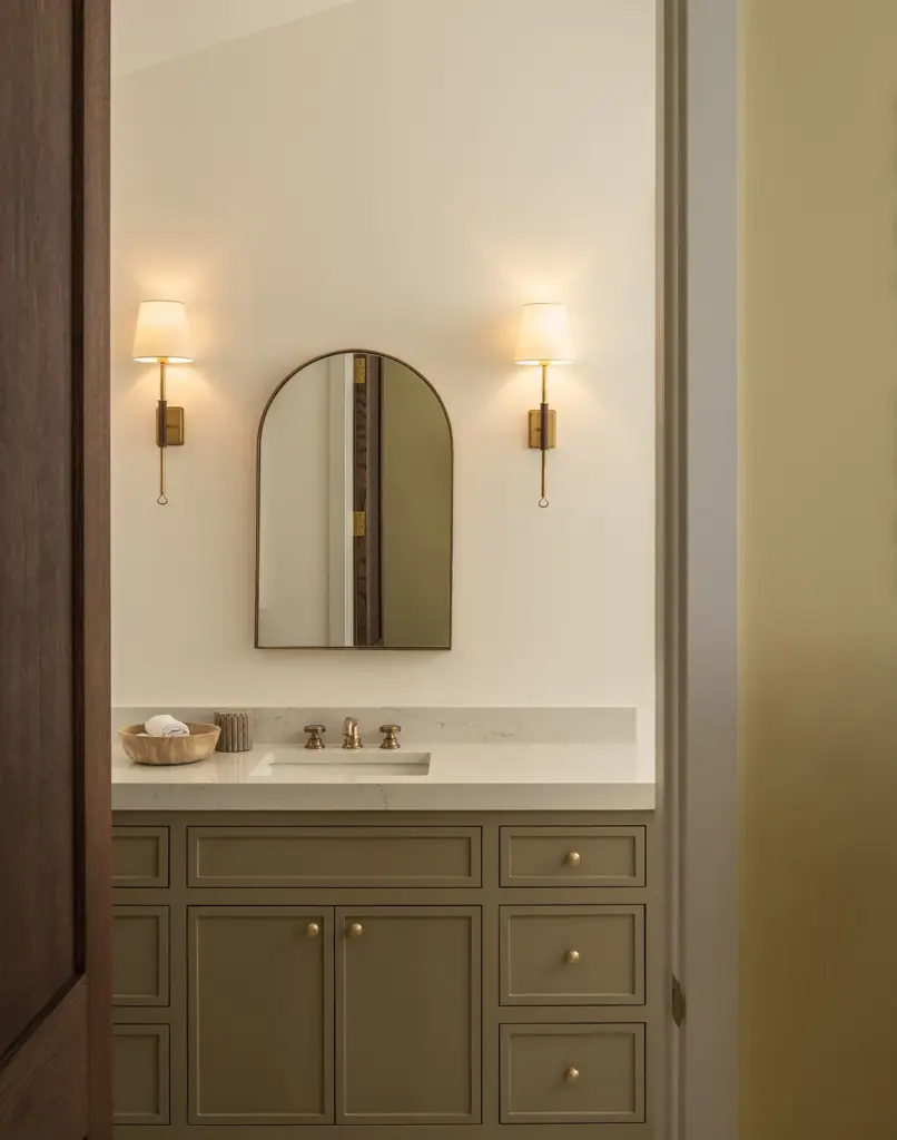
60-30-10
The 60-30-10 rule is a universal tool in the interior design world. Implementing this one simple rule can make a huge impact on a space and create a more harmonious design. The rule is this:
60% – Primary Colour
30% – Secondary Colour
10% – Accent Colour
Using the 60-30-10 rule as a foundation for your design is a great way to ensure the colour in your space does not become too overwhelming or overbearing.
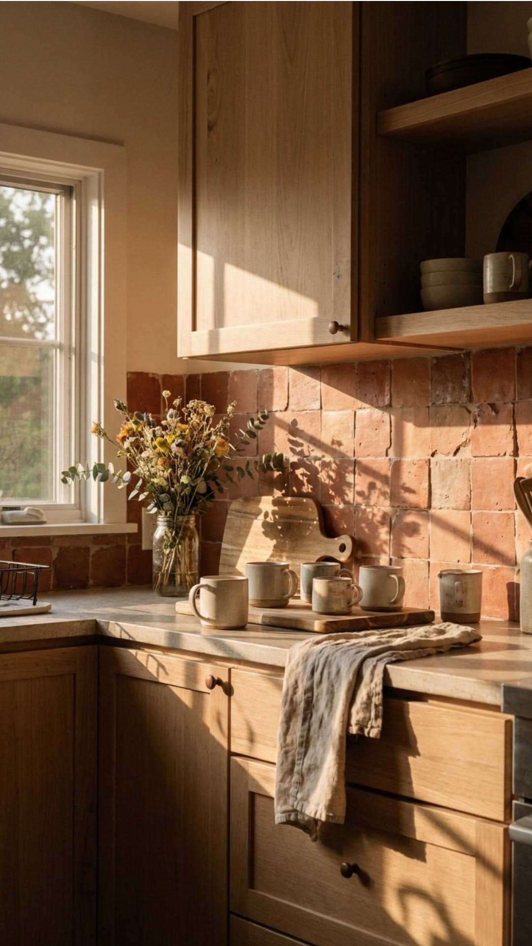
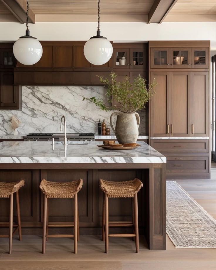
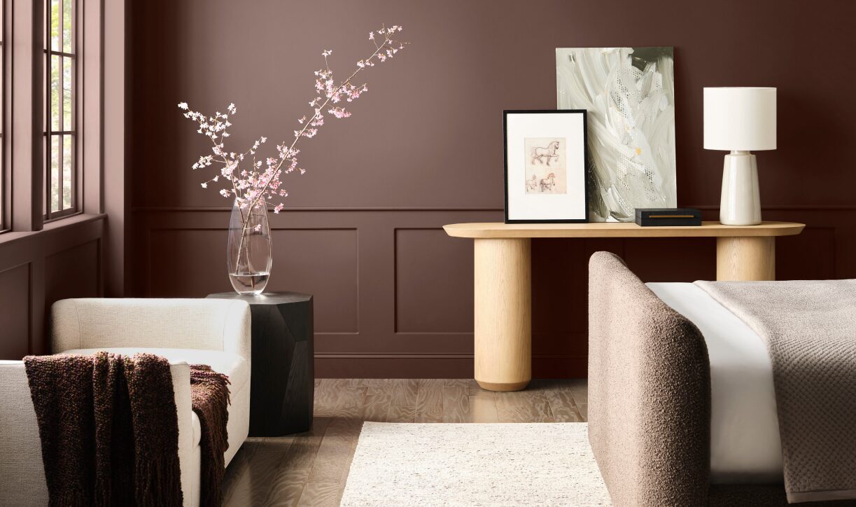
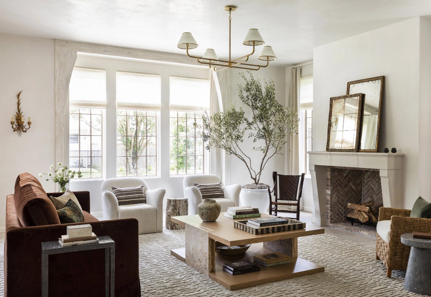
One example of this rule in effect is using a neutral colour as your 60. This provides a clean backdrop for your secondary and accent colours. Your 30 should support your main colour while incorporating interest and depth in the space. This colour can be seen in upholstery, bed linens, throw cushions, furniture, and even paint. Lastly, your 10, or your accent colour. This can be artwork, throw cushions or other decorative items, and will bring your space together and make it feel more cohesive and complete.
2
Psychology & Functionality
The colours around us impact the way we feel more than we realize, and we can use this to our advantage in interior design. Colour can be used to evoke productivity, rest, creativity, and more. Making interior colour choices based on this helps to create functional spaces specific to your personal lifestyle.
It is important to consider the function of your space and what kind of mood you want to create, then choose colours that will help you achieve it.
Warm – Warm tones evoke emotions such as comfort, happiness, and energy. This includes red, orange, and yellow.
Cool – Cool tones including green, blue, and purple, are often associated with emotions such as calmness or sadness.
Bright & Bold – These colours will create a creative space and stimulate activity and productivity. Bright colours can often feel overwhelming or intense in residential interiors, but are great for children’s spaces or commercial applications.
Pastel – Pastel tones are perfect for creating a calming and joyful atmosphere.
Muted – Muted tones are a great way to subtly incorporate colour into a space. Using a muted over bright colours creates a nature-inspired look and adds interest while preserving the simple feeling we get from neutral colours.
3
Trendy vs. Timeless
The trick to creating a “trend proof” space is to base your colour decisions on functionality and proportion rather than what is popular.
Consider the function. How is the space being used? For example, if your space gets dirty often, consider using a more forgiving colour. Or if you want to create a relaxing space opt for a muted, cool toned colour like blue or green.
Consider proportions. Balance the amount of colour throughout the room, and create unity with a cohesive palate.
This is where colour theory comes into play. The colour wheel is a great tool for determining your palate and creating a balanced theme in your space.
Complimentary – Complementary colours are opposite of each other on the colour wheel. This is a great way to implement a high-contrast colour scheme that adds interest and creates a harmonious design.
Triadic – Triadic colours create a triangle on the colour wheel. This creates a bold contrast using colours in three different colour groups.
Analogous – Analogous colors sit next to each other on the colour wheel and create a low-contrast palate, with similar undertones.
Monochromatic – A monochromatic colour palette uses multiple different shades, tints, and tones within one colour hue. This creates a simple and cohesive design, using only one colour hue, this theme is a perfect way to introduce colour for those who typically avoid it.
Creating a space that feels timeless and elegant as well as unique and personalized is possible and colour is a great tool to make it happen. Follow these steps to create your perfect design with a personalized colour palette for both your lifestyle needs and design goals.